Åpenhet
2023
⎯
WEB
Åpenhet: Data Visualisation Project
Åpenhet, a Norwegian company, approached us through the university with an intriguing design challenge.In Norwegian, penhet is pronounced as Openhet. The becomes O in English. It means openness in English.
It is a Norwegian company that develops a number of tools for its clients where they can develop their own data management platform to visualise data, make cross-factor comparisons, or survey collection, and more.
Who?
In this design challenge, we were supposed to figure out who are the user-personas of the product or information website. As well as, how can one design a tool where complex information like that of the public sector be visualised and presented in an easy-to-digest manner.
The design challenge was divided into 2 parts:
Design Question 1: How to define the design challenge given by the client and who are the right set of user-personas?
Design Question 2: How to present complex information to the public sector that is meaningful and resourceful?
Why?
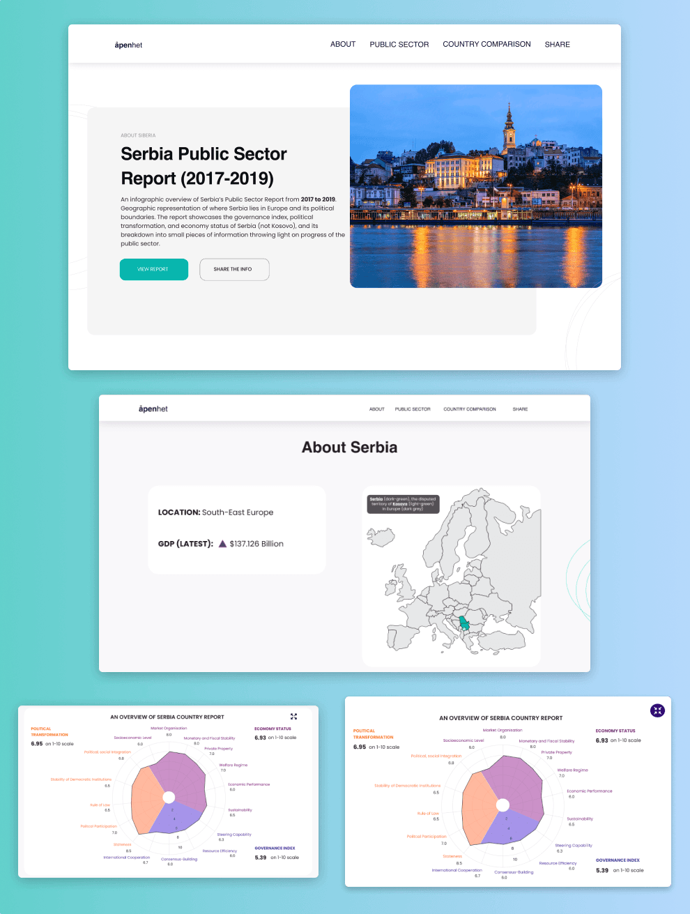
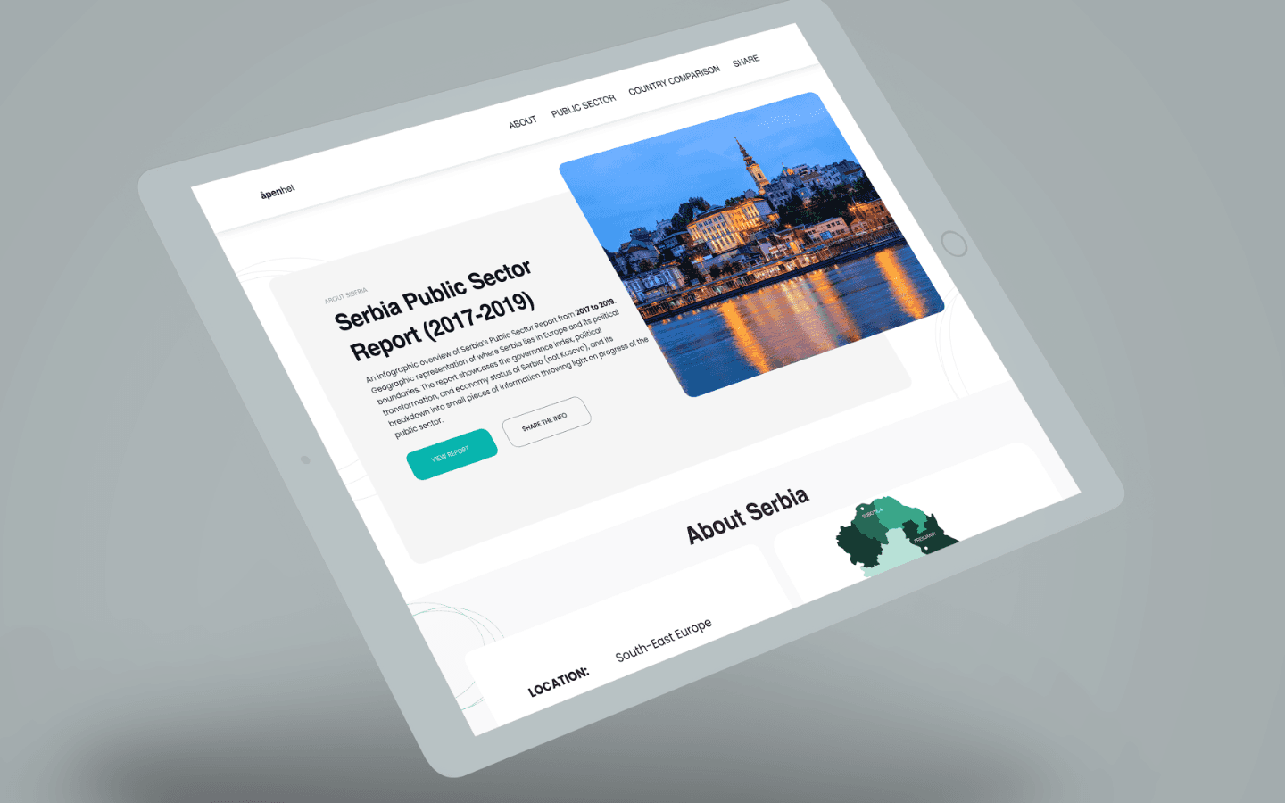
Design Challenge: To design an interactive information website to showcase development of Serbias public sector from 2017 to 2019 through visualisations for a Norway-based client, penhet.
How?
My process has always varied in different projects and is determined by many factors such as the project goals, business needs, complexity of the problem, time and etc. Here Ill describe my process for solving this problem.

Brief: This was the brainstorming phase, session with the client to understand the user-personas, competitors, user-journey, and the overall vision of the client.
Research: Through the support of my team, I was involved in brainstorming, finding out who the users are, how to divide them, to identify their pain points, opportunity and insights.
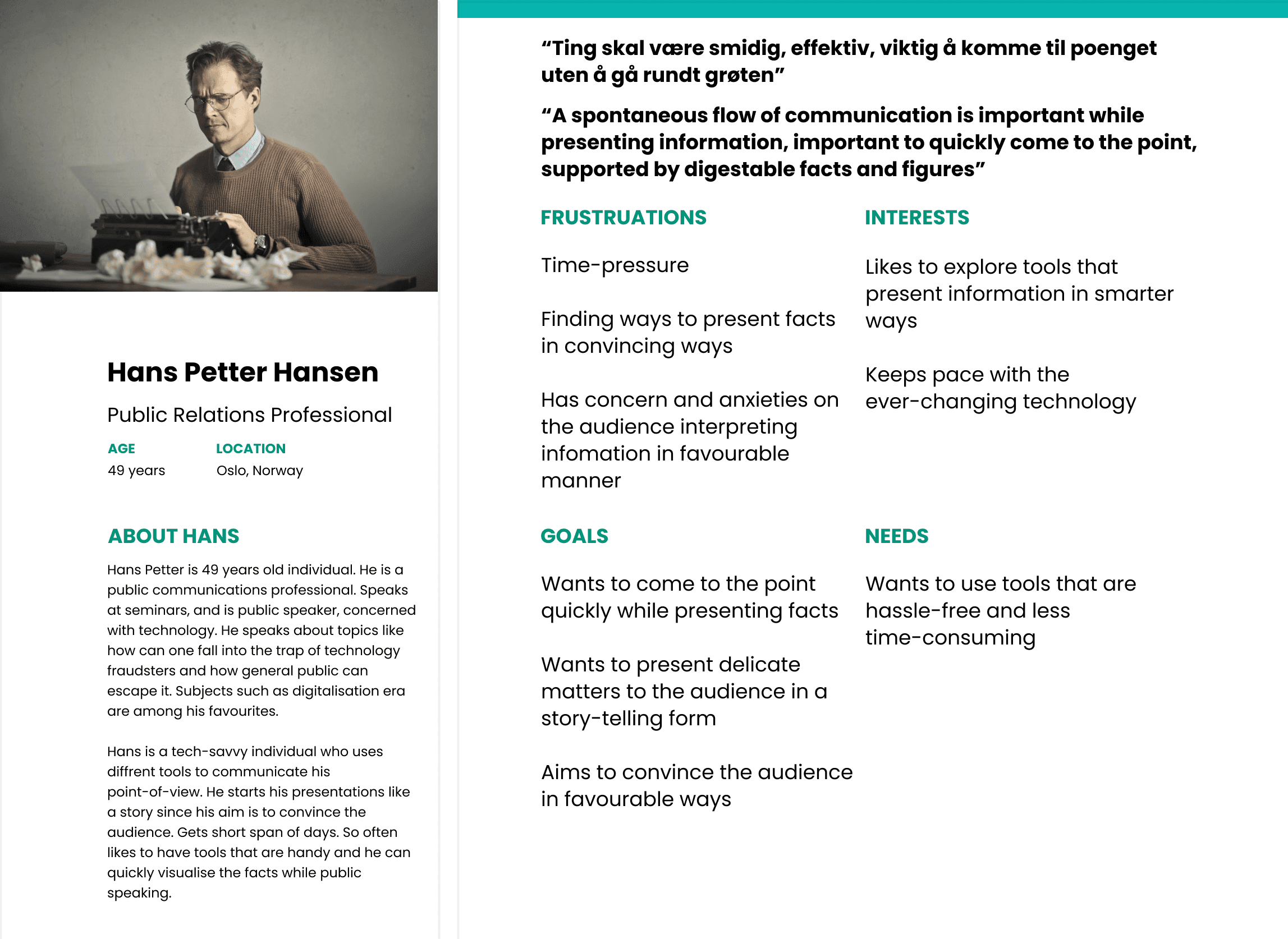
Due to complexity and wide-range of users, the process was simplified by dividing the users into 2 groups:Primary group (age 45 to 59 years): Diplomats/Public Relation professionals, professionals from EU Commision, and lobbyists. Their aim is to convince their audiences who are the journalists and the general public. They want to convince the mentioned audiences about the reports of the country they present. They're the main audience who might want to potentially use the presentation tool of the client.
Secondary group: The Journalists and mass media professionals act as a medium for the primary group to transmit the engaging and easy-to-digest information that they interpret.
Tertiary group: General folk and the citizens of the country and international public for whom the public policies are made accessible and the processes are made transparent.
The user-persona interviews were sent to the primary group- PR communication professionals.
Analysis:

Key Findings:
Answer to Design Question 1: How to define the design challenge given by the client and who are the right set of user-personas?
Primary group findings: We found out the needs of our primary user-personas. The audience of the primary group are the general public.The medium is journalists and media professionals. They get 4 days to make presentations. Prefer presentations in the form of visualisations so that they can convince their audience in an engaging and favourable manner.
Secondary group findings: They are journalists who get 3 to 4 hours to prepare news stories. Since they dont want their news to be edited too much and reduced, they prefer visualisations.
Tertiary group findings: The general public is very conscious of their environment, concerned about what government is doing to make the policies that are favourable for them, at individual level and national level. They prefer transparency and credible facts.
Design:
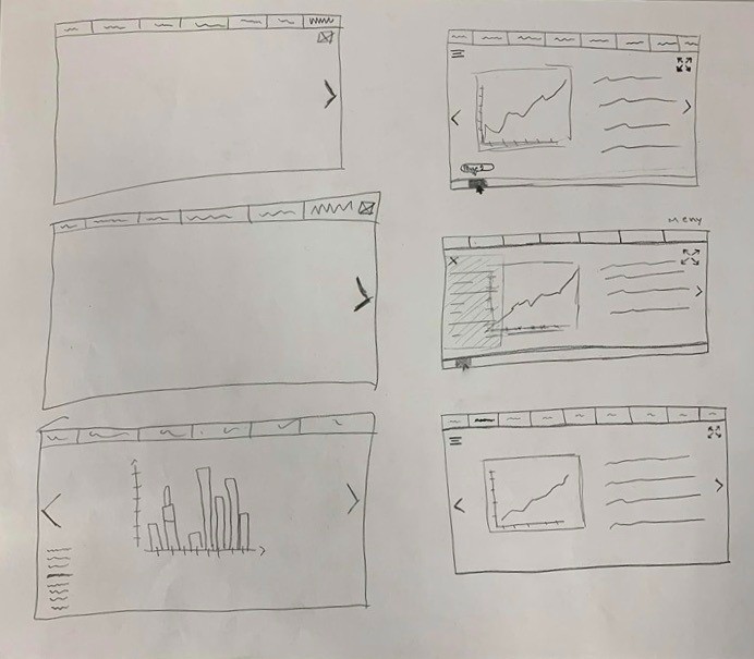
Once the research phase was completed, we worked with sketches to find out and prioritise the possible solutions.
The users wanted to see more of the value of the public report
They wanted an analysis of public sector in more of a visual form
Wanted more colorful visualisations
Experienced navigation problems

Testing and Iterations:
I went back and forth throughout phase while I was iterating. The best way for me to visualise stuff is with sketches. So I sketched out the possibilities again.
Changes made after user-testing:
Changed the colors to make the visual interface look engaging
Made the navigation easy
Summarised public sector in the form of radar chart, bar graphs, etc.

Results:
The client used the prototype as inspiration to design a presentation tool.