Ryden AS Logo Design and Brand Identity
⎯
Branding and Graphics
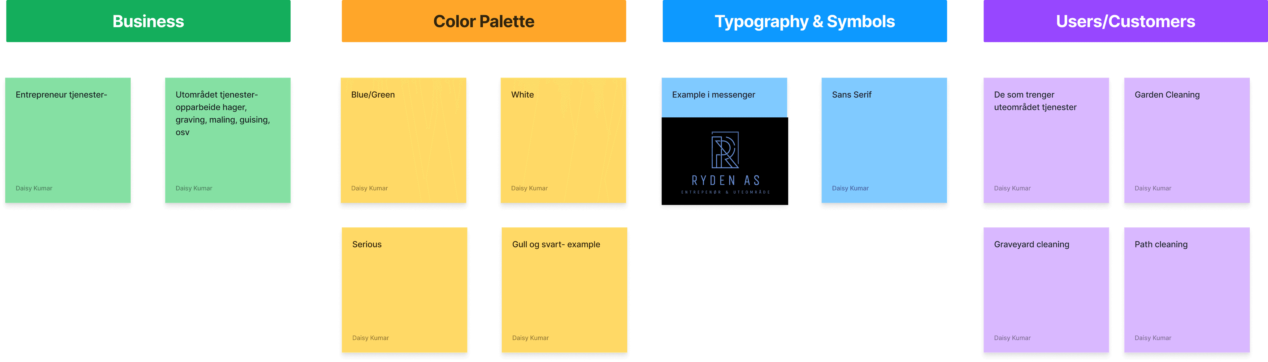
About the Client:
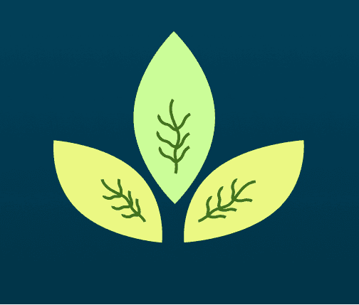
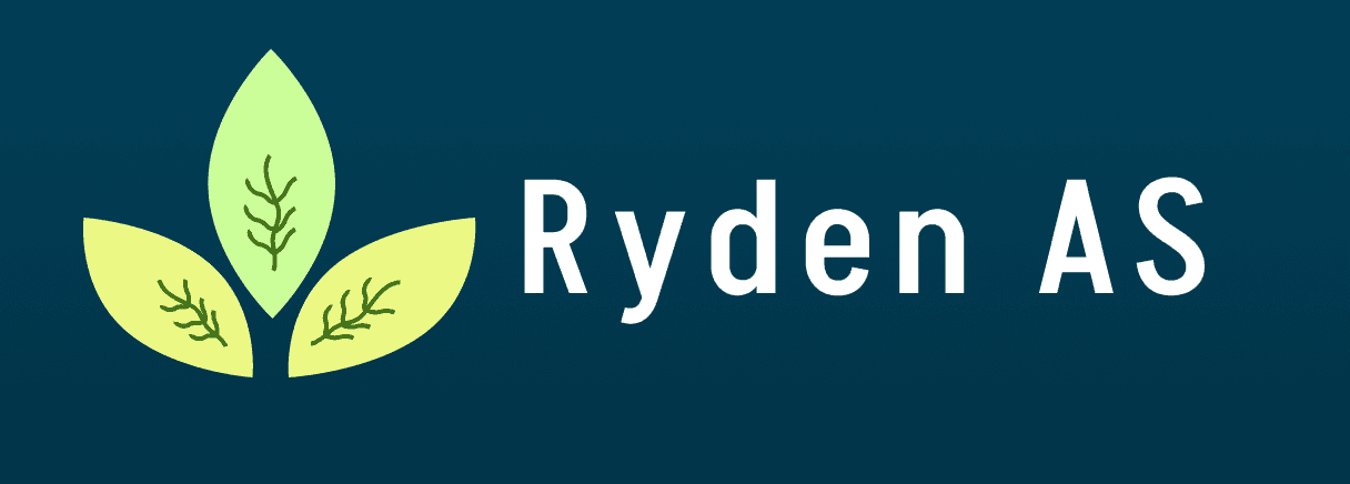
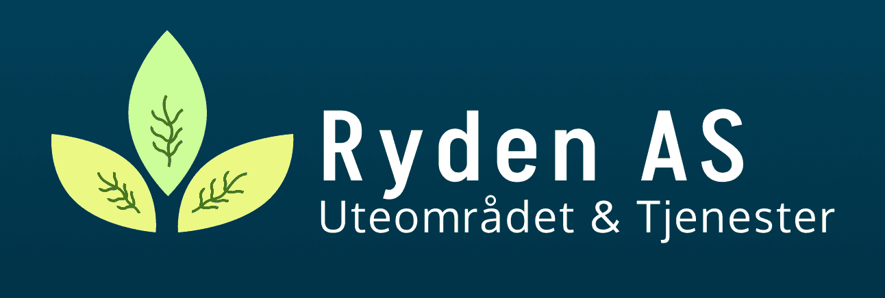
Ryden AS is a company that deals with gardening and landscape services. They came to me to design a logo; also wanted to have a fonts and color palette that could potentially represent their brand that's close to nature, harmony, cleanliness and calmness. It was also crucial for them to give an impression of a strong sense of seriousness and professionalism to their logo design.
Target Audience:
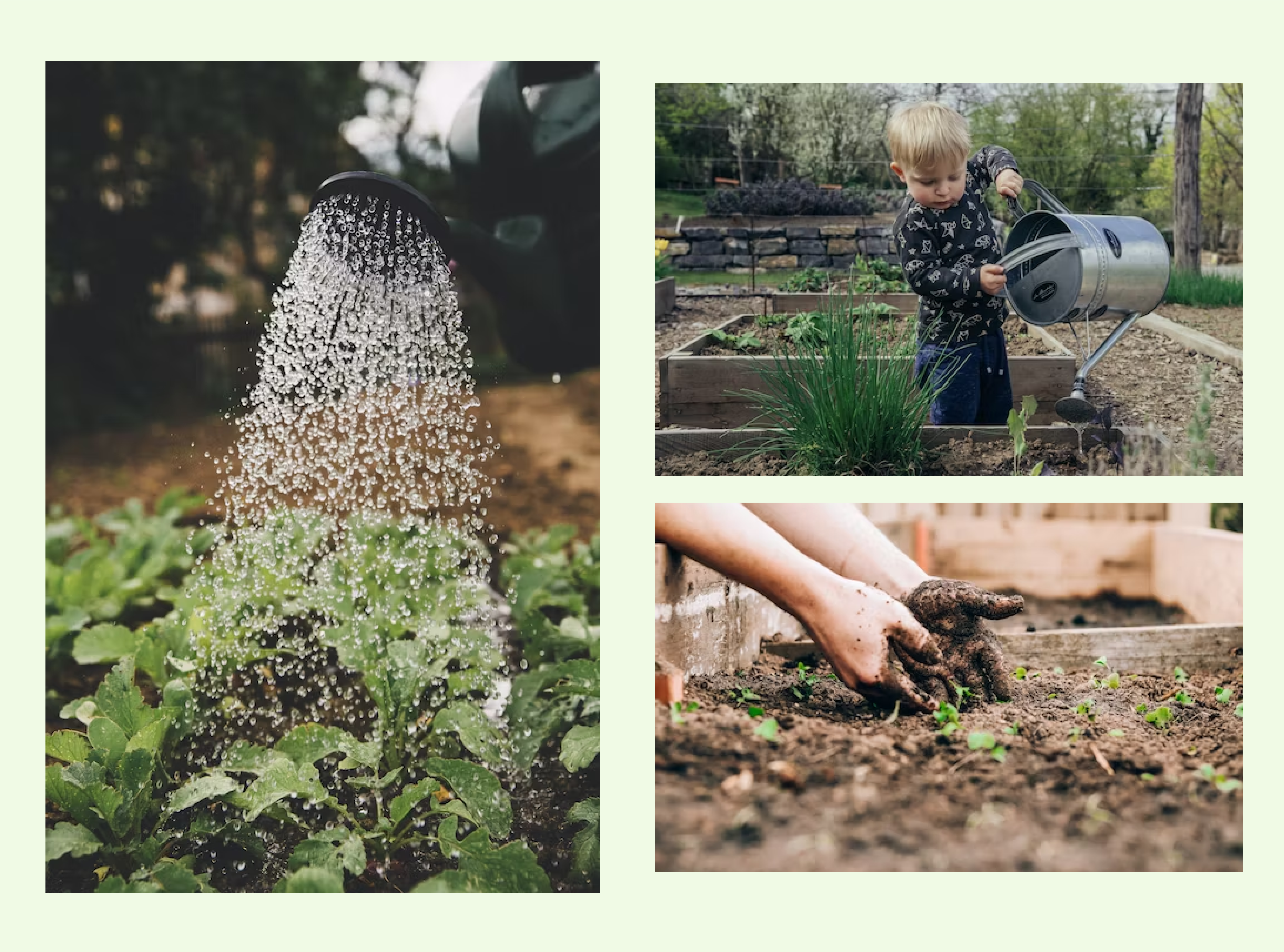
Those from Norway who are interested to have gardening or landscape services. There can be some who might be in need of maintenance of streets and graving services.
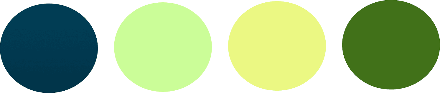
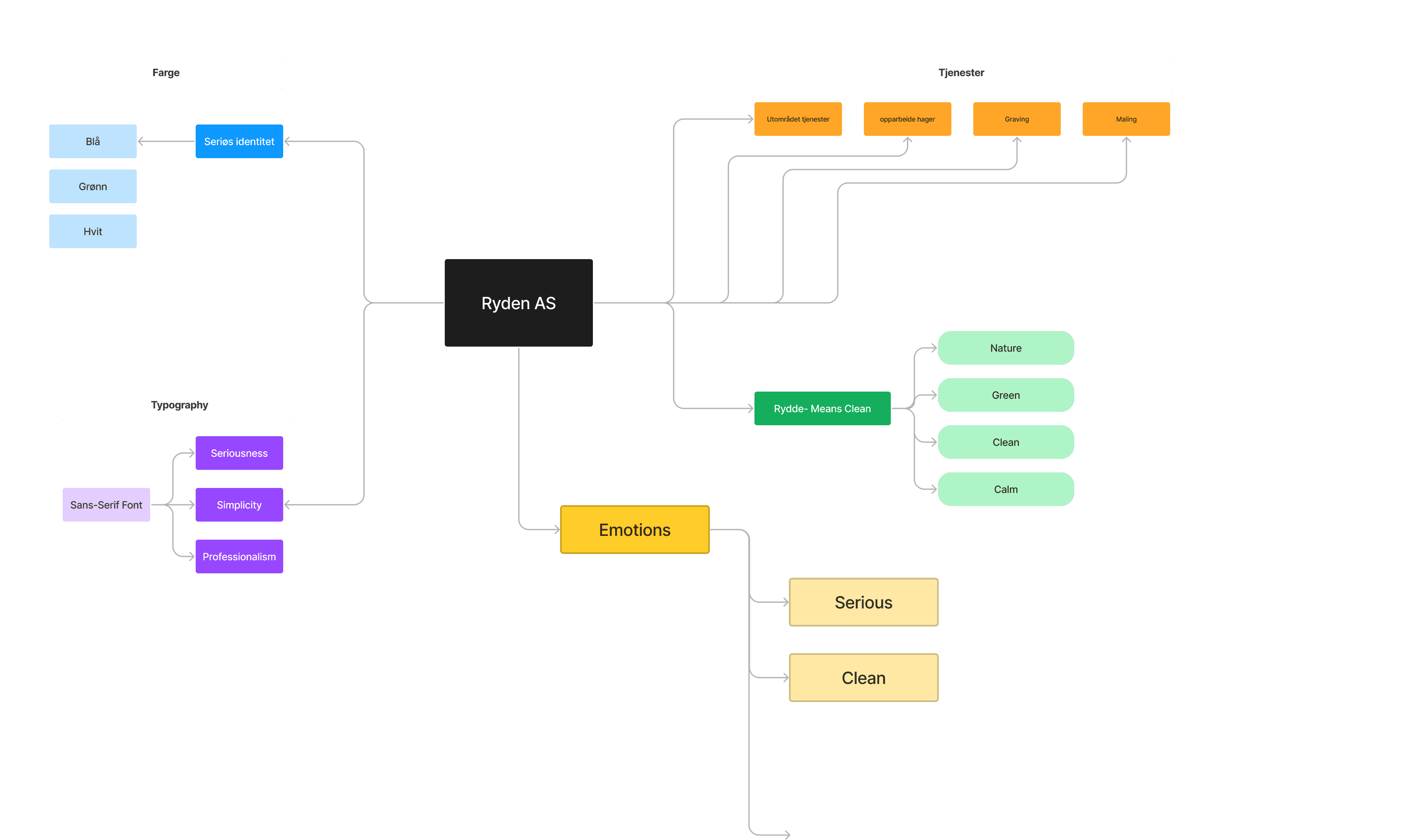
Desired Color Palette:
The client wanted to have a color palette close to nature. That communicates calm and serenity. At the same time, it reflects seriousness of the company when it comes to catering its services to its customers.
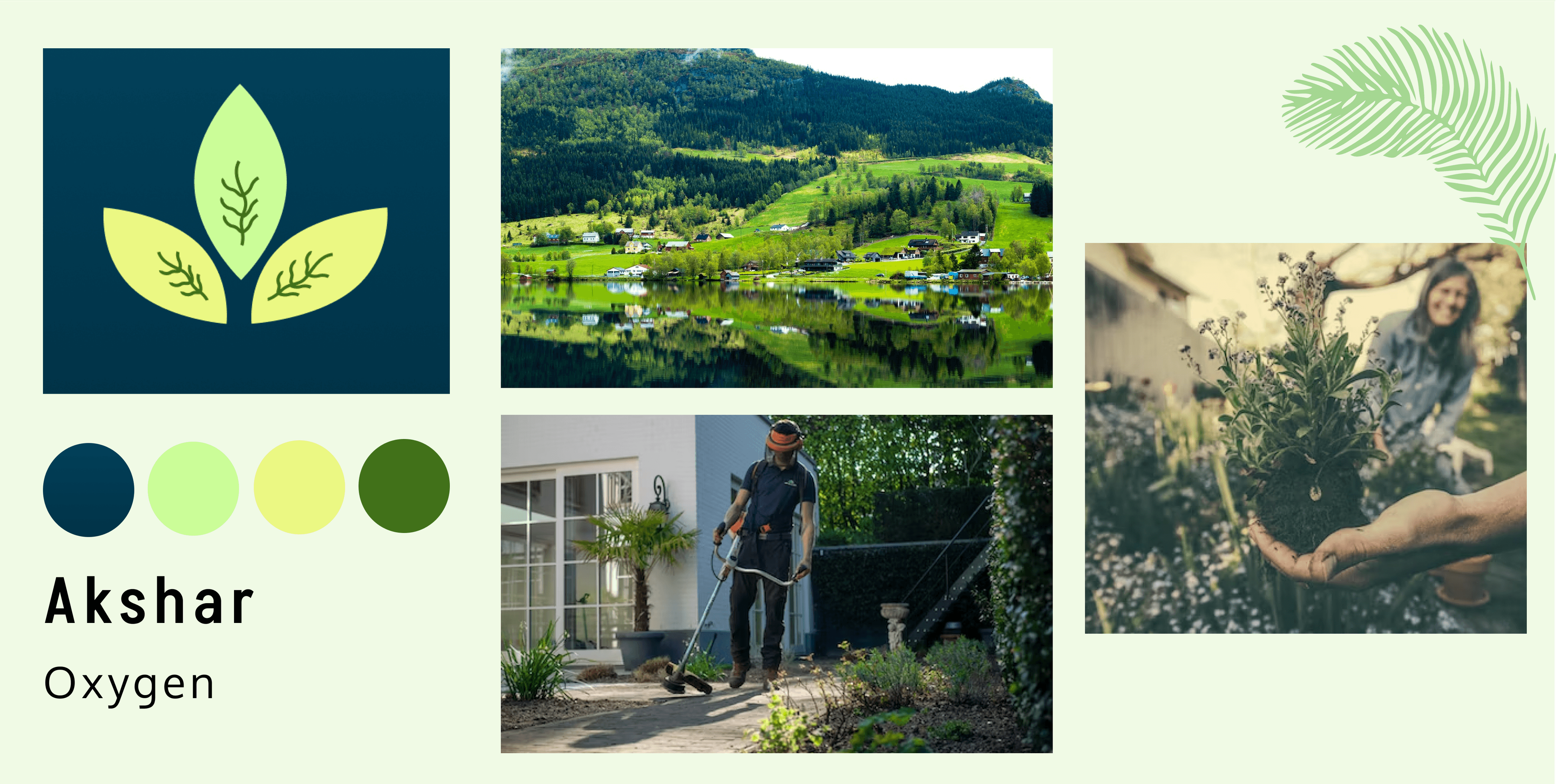
I selected color palette from nature and landscapes of Norway. Picked up variations of green that marked creativity and nature, calmness and peace. Combined them with darker shades of blue that convey professionalism and seriousness of the company.
Here are the following steps:
Workshop with client:
I wanted to know how my client thinks, what are his needs and preferences, and how he visualises his brand to be. I translated all his thoughts in a simple yet challenging brainstorming ideation exercises with the client- which was fun and a learning experience.
Word-mapping and brainstorming of concepts:
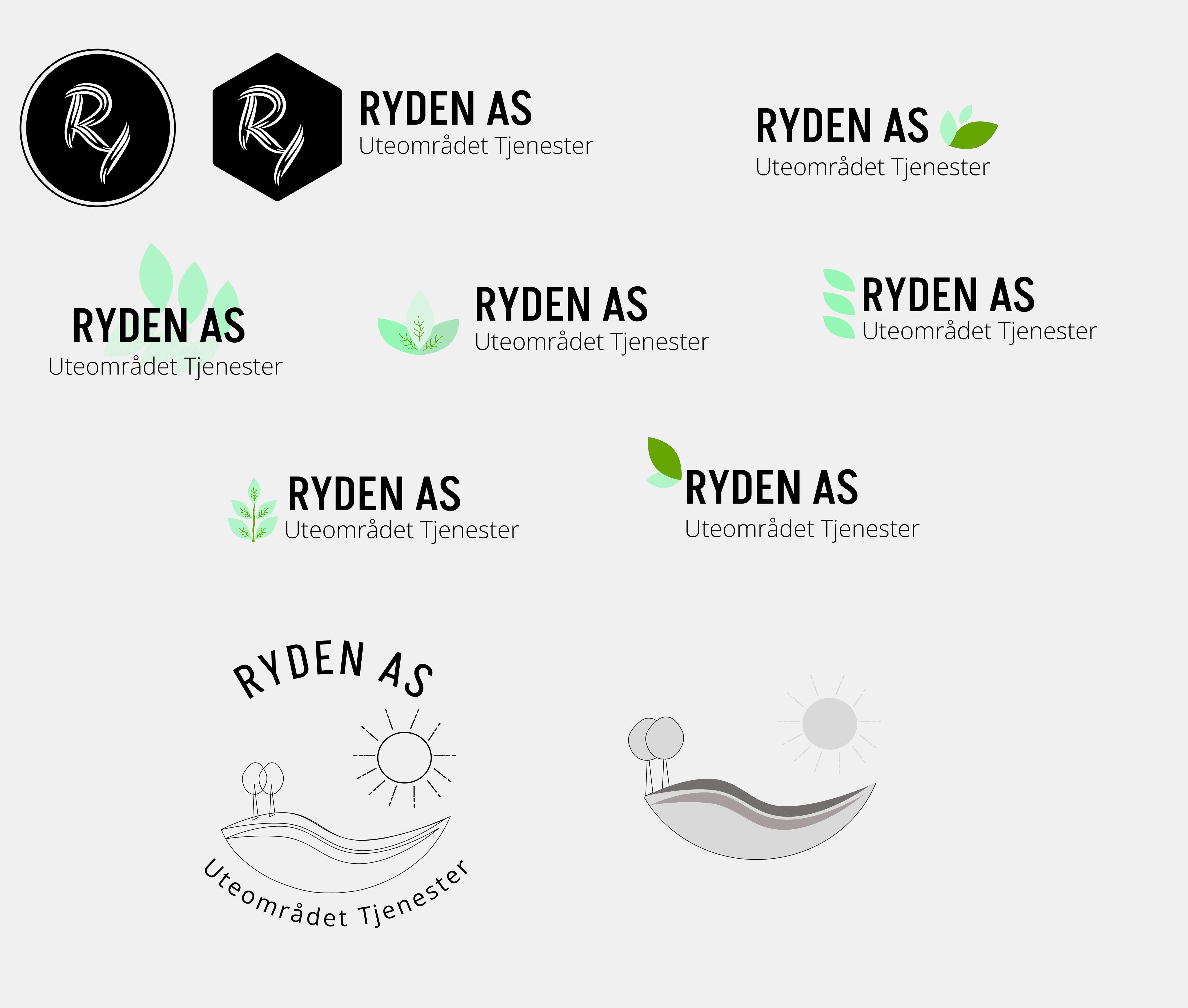
Here it was when I sat, jotted down my thoughts, and connected all the dots in my mind, brought it on a piece of paper with word-mapping and brainstorming exercises.
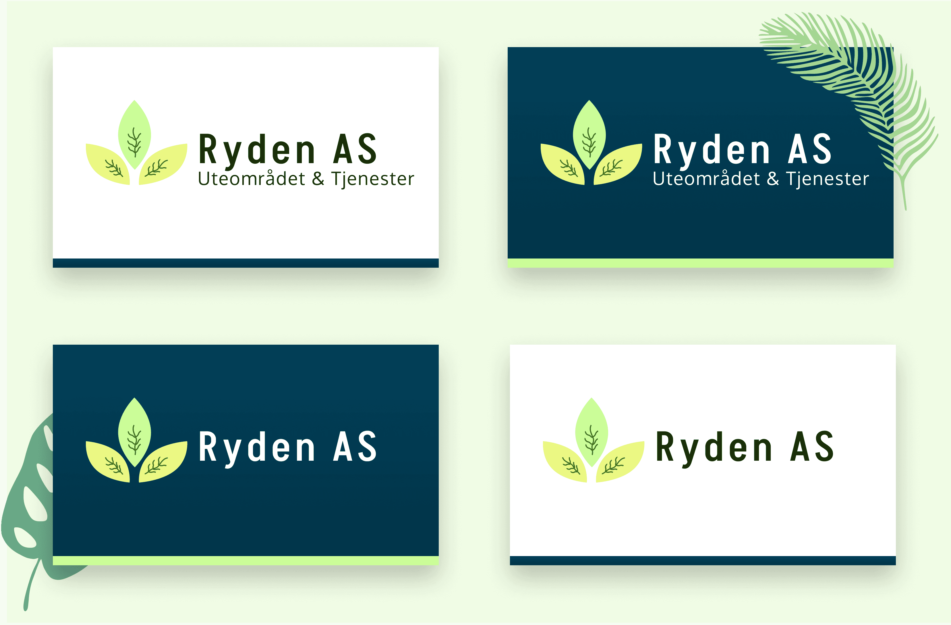
Color variations and typography:
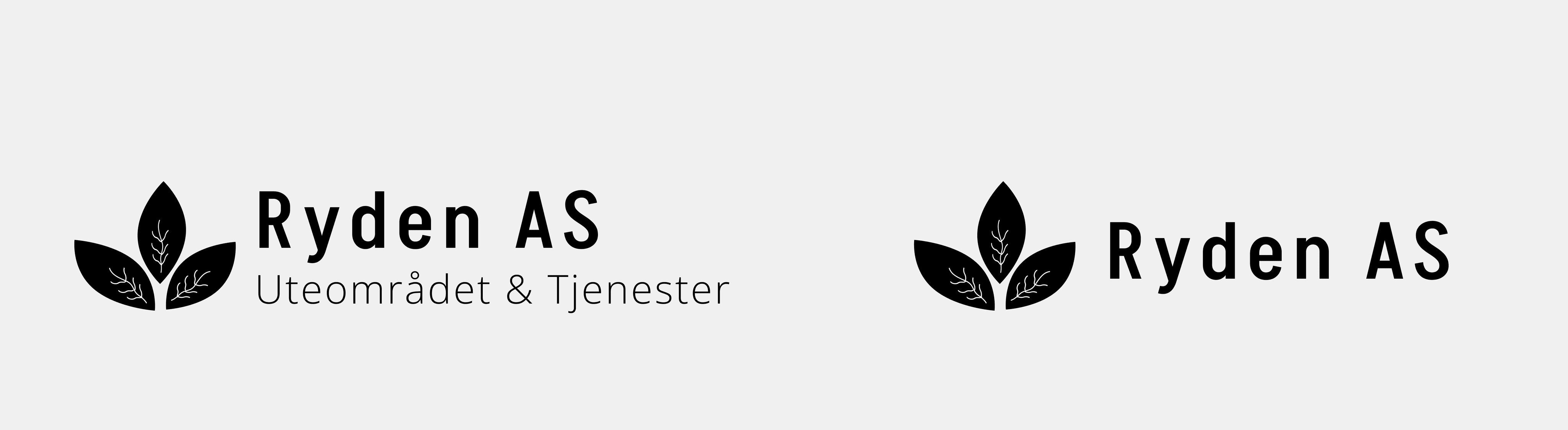
The Final Mockup: